Page 1 of 1
Preferred network player selection looks ugly in Emerald Mine artwork
Posted: Fri Apr 22, 2022 12:32 pm
by mat
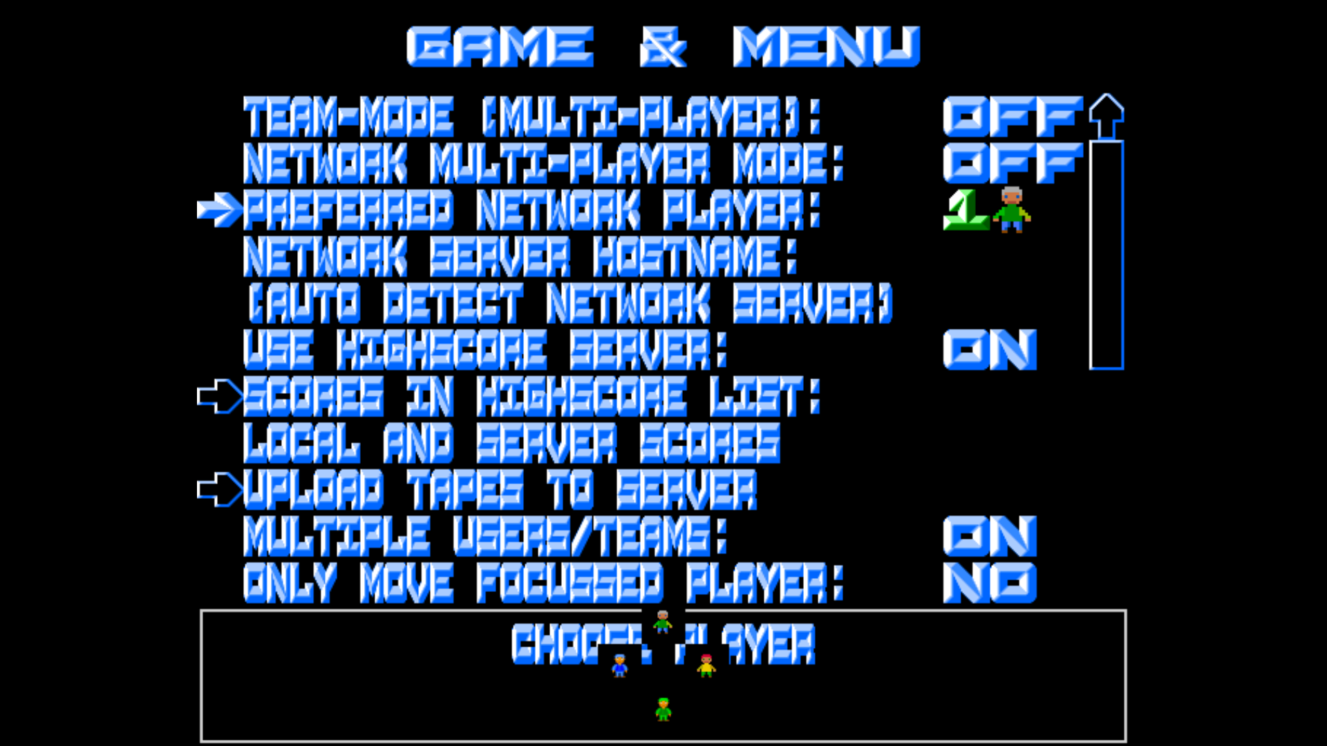
- rnd_bug.png (324.64 KiB) Viewed 3202 times
The player icons should be positioned in single file. They could also be a bit larger to be more legible.
Re: Preferred network player selection looks ugly in Emerald Mine artwork
Posted: Sat Apr 23, 2022 5:26 am
by TheOnyxGuy
This is partly normal because the levelset was created before such feature was added, but this can be fixed by adding such lines to graphicsinfo.conf of the levelset:
Code: Select all
request.button.player_1.x:		243
request.button.player_1.y:		46
request.button.player_2.x:		292
request.button.player_2.y:		46
request.button.player_3.x:		340
request.button.player_3.y:		46
request.button.player_4.x:		388
request.button.player_4.y:		46
Just as an example
Re: Preferred network player selection looks ugly in Emerald Mine artwork
Posted: Wed Apr 27, 2022 9:30 am
by Holger
As always, thanks a lot, Eizzoux, for the prompt solution!

Yes, this is indeed missing in the graphics definitions used by the EMC level sets.
As there are quite a number of different graphics sets (due to many different EMC graphics) for the EMC level sets, it would be a lot of work to fix this problem manually, so I will fix this in my script which generates the EMC level collection, and release a little update which fixes this problem.