Page 1 of 3
Boulder Dash Fan Site officially launched!
Posted: Sat Mar 04, 2006 3:12 pm
by Martijn
Hello guys,
Here a one-time spam post about my site.
Now it has been officially released! As this is a kind of milestone for my site, I decided to make a new topic for it.
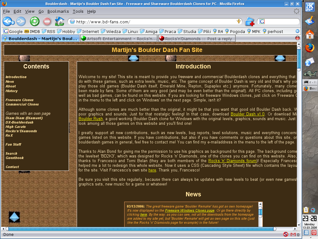
Visit
http://www.bd-fans.com to see it! And please sign the new guestbook!
If you have got something for me to put on the site, then contact me and I will upload it! And if you have other suggestions or comments, feel free to mail me about it!
Please help me spreading the site across the Internet. If you can write about it on a forum, then do it, I'd say. And if you'd like to, then tell about it to your friends!
Posted: Sat Mar 04, 2006 5:46 pm
by Holger
Congratulations, Martijn! :-D
It is really a great BD/EM/SP ressource now! Very impressive -- great work! :-)
Posted: Sat Mar 04, 2006 7:55 pm
by Zomis
Looking good Martijn.
But how about a note that most of the levels you have there are copied from the files archive? I don't mind at all that you have them there, but a little more advertising for the files archive would be nice

Posted: Sat Mar 04, 2006 8:28 pm
by Martijn
Zomis wrote:I don't mind at all that you have them there, but a little more advertising for the files archive would be nice
Can't you remember that I made a promise with you on MSN... that I would put a readme file in all the level files from your RnD archive (though they are always a bit different from the ones on your site, as I give them proper names, sort priorities, etc.)?
Download some files and you will see that each of them contains the following text:
***
This file originally comes from
http://www.zomis.net/rnd/
Thanks to Zomis for giving me the permission to arrange and provide it on my site.
***
But if you wish, I can also put a text at the beginning of the 'Levels' section with a link to your site, just as an extra advertisement for your site!
Posted: Sat Mar 04, 2006 8:54 pm
by Zomis
Martijn wrote:Can't you remember that I made a promise with you on MSN... that I would put a readme file in all the level files from your RnD archive (though they are always a bit different from the ones on your site, as I give them proper names, sort priorities, etc.)?
Ooops... Indeed I forgot that
Thanks for reminding me

*I need more/better memory*
Posted: Sun Mar 05, 2006 7:38 am
by Rockford4ever
It's great you have a complete site! And it's nice to see the "wrong borders on site" discussion is over! (Just kidding...)
It seems it was the longest topic on the site, too...
But it seems the 'Retro' soundspack I gave you
still isn't uploaded...


Posted: Sun Mar 05, 2006 2:14 pm
by Holger
I have also announced your new site on the main (News) page of
www.artsoft.org.
Thanks again for your great work! :-)
Posted: Mon Mar 06, 2006 5:07 pm
by Martijn
Holger wrote:I have also announced your new site on the main (News) page of
www.artsoft.org.
Thanks again for your great work!
WOW! Thank you very much for this, Holger!
Rockford4ever wrote:But it seems the 'Retro' soundspack I gave you still isn't uploaded... Crying or Very sad Wink
That was only because I was busy with the redesigning work... but I wrote everything down and I will upload the Retro pack and the other RnD things soon!
Posted: Mon Mar 06, 2006 8:53 pm
by HerzAusGold
Very nice site now!
Only one thing:
The news section display is very small.
I think seperate the news from the other stuff (or vice versa) is better.
Like in RND or many other sites.
Again: Very good work and very time intensiv I think..
Posted: Mon Mar 06, 2006 9:41 pm
by Martijn
Thank you!
But I tried other sizes of the news box and I think that this is exactly the right size. Small things usually look better...
And I decided to make an Iframe, which shows an apart news page on the index page. So that everyone can quickly check new updates and because then every new visitor can see that the site is certainly not dead (as he will immediately see an update of the same day or only a few days ago...

)!
Posted: Mon Mar 13, 2006 10:32 pm
by bojster
I'd like to say that it is a very nice and useful site. I'm sure you put a lot of work into it and it really shows. Congratulations and keep it up!
I also have one comment/suggestion. The page seems to use a fixed-width frame designed for 1024x768 display (at least it looks like that from my perspective). While it may seem like a good choice for most of the world, it causes a minor glitch for me. I'm using a side toolbar (not in the bottom of the screen, where the toolbar normally resides), so my screen width is a bit smaller than it usually is on 1024x768 display and because of that the site doesn't fully fit into the window of my browser (here's a
screenshot). I'm wondering if something can be done about it, because Holger's RnD page (on the design of which bd-fans is clearly based) works ok on my configuration.
Posted: Tue Mar 14, 2006 4:49 pm
by Martijn
Hi Bojster,
Thank you! I'm glad you like my site!
I'm searching for a solution to this problem so I hope it will be fixed after a while.
But I also see that you don't have the font 'Trebuchet MS' installed on your PC. Did you just set a standard font for your browser or does this font not come with (some versions of) Linux?
Posted: Tue Mar 14, 2006 6:26 pm
by Holger
> But I also see that you don't have the font 'Trebuchet MS' installed on
> your PC. Did you just set a standard font for your browser or does this
> font not come with (some versions of) Linux?
"Trebuchet MS" seems to be a proprietary Microsoft font, so you can't (and shouldn't) expect to have it available on any platform other than Windows.
And you have already solved it by using "font-family: "Trebuchet MS", serif;". This way the browser of a non-Windows user will use the font that was defined to be used as the browser's serif font. (A bit better would be to use something like '"Trebuchet MS", "Times New Roman", Times, serif' instead to choose a bit more explicitly from some well-known fonts.)
But this is not the reason for the problem bojster described. (BTW: I have the exact same problem when I make my browser a bit smaller in width.)
The solution is easy: Do not use absolute sizes on your site! A quick look into your HTML shows the following:
Code: Select all
<body style="background-image: url(Images/Background.jpg); width: 987px; background-attachment: fixed;">
This ("width: 987px") is bad. ;-)
Use something along the lines of "width: 100%" instead, for example.
You already do this partially in your CSS code, but not everywhere. Therefore, when just replacing the above "987px" by "100%", you always get some pixels left that have to be scrolled. So it seems that the HTML/CSS code have to be tweaked somewhere else, too...
Posted: Tue Mar 14, 2006 8:08 pm
by Martijn
Holger wrote:But this is not the reason for the problem bojster described.
Yes, I know, it was just a second question
And indeed, stupid, 'MS' stands for 'Microsoft', indeed.
Well, I actually changed width: 100% into exact pixels, because otherwise the site would look very strange if you made the window a bit smaller (then the cells go over each other).
So, if you know a solution... Fortunately, Francesco offered to help me with this. Without him I would never have had such a clean and perfect code! And then, the site would still look like the old index page, still hosted somewhere on Tomi's server! That's far less attractive...
Posted: Tue Mar 14, 2006 11:17 pm
by Francesco
Martijn wrote:Without him I would never have had such a clean and perfect code!
I'm sure you aren't speaking of me, are you?
I would love that my code were "perfect and clean", but it isn't, believe me. CSSplay has shown me "some" light, and how awful were the bugs lurking in the dark! - well, after all, at least the layout is clean
Now I believe that your site could be done in this same way, but completely resizable instead of fixed... I just need to make some order in the things I've decided to learn in this wonderful new year...