Page 1 of 1
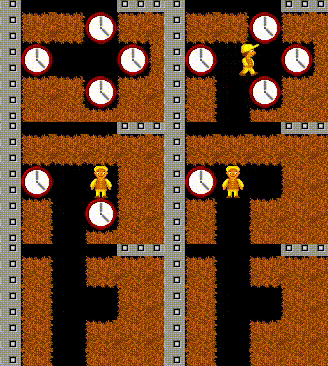
4.4.2.0: animation for collecting clock is messed up
Posted: Mon Jun 08, 2026 4:45 pm
by ncrecc
- clocks.gif (149.71 KiB) Viewed 238 times
Re: 4.4.2.0: animation for collecting clock is messed up
Posted: Tue Jun 09, 2026 12:24 pm
by ncrecc
this came out the slowest gif in the world for some reason. the clock collecting animation has only two frames and consists of the dirt underneath the clock being dug and then un-dug. i think in past versions dirt simply appeared in its place with no animation.
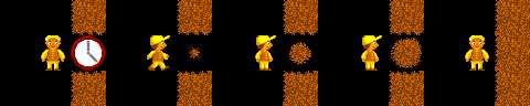
(...maybe collecting clocks could have an animation where dirt visibly expands from the center of where the clock was?)
Re: 4.4.2.0: animation for collecting clock is messed up
Posted: Tue Jun 09, 2026 12:37 pm
by ncrecc
ncrecc wrote: ↑Tue Jun 09, 2026 12:24 pm
(...maybe collecting clocks could have an animation where dirt visibly expands from the center of where the clock was?)
mockup

- dirt_appears.png (1.46 KiB) Viewed 220 times
not intended to be a series of objects like "clock birth" but purely an animation to be used with the "smooth element movement" feature since it seems to really want to have an animation for collecting clocks anyway.
this was made with the assumption that surrounding dirt wouldn't try to regroup with the dirt from the clock until whatever animation the dirt does is finished. like so:
- dirt_appears_context.png (6.03 KiB) Viewed 217 times
Re: 4.4.2.0: animation for collecting clock is messed up
Posted: Fri Jun 12, 2026 11:15 pm
by Holger
Fixed with new patch release 4.4.2.1.
Your suggested graphics to replace the BD style clock when collected are really good, and very much matching the style of the dirt (sand) graphics! However, my intention was that surrounding dirt would "close" after the clock was collected (even though I have no idea why the clock should be replaced with dirt instead of just space), but the animation for it was broken before. Now it should look better. But yes, if there is no other dirt around, your animation probably looks better, I think...