Holger's family name is 'Schemel' with only one 'l', you might want to edit the top post...
In these mockups I can't help wondering what benefit most of the words provide:
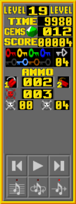
Certainly the word 'KEYS' is utterly irrelevant if each key is already present as a grey shadow.
'EMERALDS', 'DYNAMITE', and 'DYNABOMBS' are each represented by their respective graphical image. For the latter two, perhaps a single word 'EXPLOSIVES' or 'AMMO' followed by the -- wow, are there really 5 different types of explosive? -- 5 icons and their corresponding counters. I don't know if the customization features support this, but if possible, make it so that 'hovering' (mousing over) the icons & counters displays the name and maybe explanation of what the heck those are. I know that I don't know the distinction between dynamite vs. dynabombs (as I haven't played any levels with dynabombs in a year or so); certainly don't know the difference between two types of dynamite. Point is, it's unclear that just having a single-word name is particularly more helpful than the icon alone. Omitting the names and adding hover explanations would be a giant improvement.
I would probably group SCORE, TIME and EMERALDS, since those are the three overall 'goals' of any BD / EMC / RnD type level. Well, really it's EMERALDS, with TIME as a possible constraint and SCORE as a nearly complete irrelevancy :)
Anyway, EMERALDS doesn't need a name, just the icon. SCORE & TIME do need names. I think in each case it should be possible to cram the label & the counter onto a single line (EMERALDS already has its icon
twice on its line!). Is there a narrower font to use for the SCORE & TIME labels?
...
Here is a Terrible Mockup. Done by dismembering Eizzoux's last image and shuffling its bits a whole bunch... ... Leaving room for several other additions.
- rnd-mockup.png (29.58 KiB) Viewed 9281 times
